Color is one of the most powerful storytelling tools at your disposal, and also one of the most overlooked. The same shot can feel warm and nostalgic, cold and clinical, or gritty and tense depending entirely on how it's graded. We touched on the difference between correction and grading in Finishing and Delivery; this post digs into how you actually do it.
The good news: you don't need a dedicated colorist or a $30,000 grading suite to make your footage look dramatically better. You just need to understand a handful of tools and the order to use them in.
Correction First, Grading Second#
It's worth repeating because it's the single most important rule: color correction comes before color grading.
- Color correction is the technical pass. You're fixing problems — footage that's too dark, too blue, too flat — to get every shot to a neutral, accurate, believable starting point.
- Color grading is the creative pass. Once your shots are neutral and consistent, you push them toward a look: teal-and-orange blockbuster, desaturated indie drama, warm golden-hour romance.
If you try to grade before you correct, you're building your stylized look on an uneven foundation, and it'll fall apart the moment you cut two shots together.
In Sequence, all of this lives in the Color tab of the inspector — one master switch, a stack of adjustment modules, and LUT support, applied per clip.
Read Your Image With Scopes#
Here's an uncomfortable truth: you cannot fully trust your eyes, and you definitely can't trust your monitor. Your eyes adapt to color casts within seconds, and no two consumer screens are calibrated the same way. What looks perfect on your laptop may look green and crushed on someone's phone.
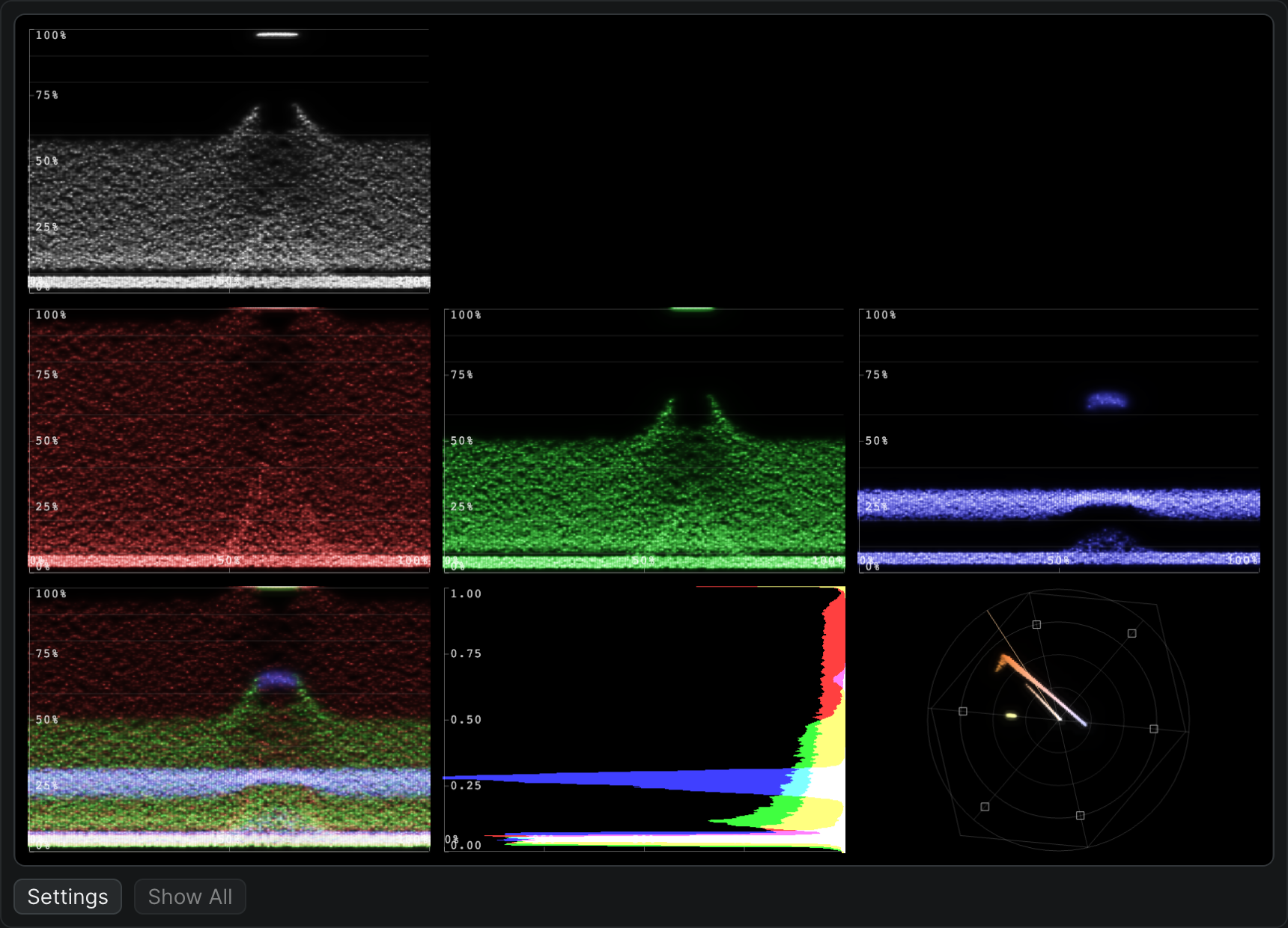
The fix is to grade against scopes — objective readouts of your image's brightness and color:
- Waveform — plots brightness (luma) from bottom (black) to top (white). Use it to set your blacks and whites without crushing detail.
- Histogram — shows how your tones are distributed. A big spike jammed against the left edge means you're losing shadow detail.
- Vectorscope — plots color and saturation. Skin tones should sit along the "skin tone line"; it's the fastest way to catch a color cast.
Sequence has built-in video scopes — waveform, histogram, and vector scope — so you can grade to the data, not the vibe.
The Core Adjustments#
Almost every grade, no matter how fancy, comes down to a few fundamental controls:
Exposure and Contrast#
Set your overall brightness, then set your black point and white point. A little contrast makes an image "pop," but crush the blacks too hard and you'll lose all the detail in the shadows.
White Balance#
This neutralizes color casts — the orange of indoor tungsten light, the blue of open shade. Nail your white balance first and half your "grade" is already done, because the image simply looks right.
Saturation#
How intense the colors are. Beginners almost always over-saturate. Pull it back until it looks natural, then nudge it up slightly.
In Sequence, these live as the Light, Color, and Creative sliders in the Color tab — the meat-and-potatoes controls you'll reach for on every clip.
Color Wheels: Shadows, Midtones, Highlights#
Once the basics are dialed in, color wheels are where a grade gets its personality. They let you push a color cast into three separate ranges of the image independently:
- Cool teal into the shadows
- Neutral, accurate midtones (this is where skin lives — protect it)
- Warm gold into the highlights
That single move — cool shadows, warm highlights — is the backbone of the "cinematic" look you've seen a thousand times. Sequence's three-way color wheels do exactly this.
LUTs: Your Shortcut to a Look#
A LUT (look-up table) is a preset that remaps every color in your image in one uniform move. There are two kinds you'll actually care about:
- Input / camera LUTs apply before you grade. If you shot in a Log profile (more on that in Color Profiles and HDR), your footage looks milky and washed out straight out of the camera. An input LUT built for your specific camera converts it into a normal, correct color space (usually Rec. 709) so you have a sane starting point.
- Creative LUTs apply after correction. These are the "looks" — film emulations, bleach-bypass, moody teal grades. Treat them as a starting point, not a finish line; you'll almost always tweak on top.
Sequence applies LUTs as part of the color stack, including your own uploaded .cube files, so a camera-conversion LUT and a creative look can sit on the same clip.
Match Your Shots#
The mark of an amateur grade isn't a bad look — it's an inconsistent one. When you cut from a wide to a close-up and the skin tone jumps from pink to orange, the whole scene falls apart.
So grade in context. Get your hero shot looking right, then match every other shot in the scene to it, checking against your scopes as you go. Consistency across a cut matters more than any individual shot being perfect.
A DIY Reality Check#
Color grading intimidates people, so they skip it. Don't. Even five minutes of basic correction — set your black point, fix the white balance, add a touch of contrast and saturation — will transform a flat, gray image into something that looks intentional.
You don't have to be an expert. You just have to not skip it. In Sequence you can grade a single clip end to end in the Color panel, then copy that grade to the rest of your footage.
Some simple color work is always better than none at all.